Details
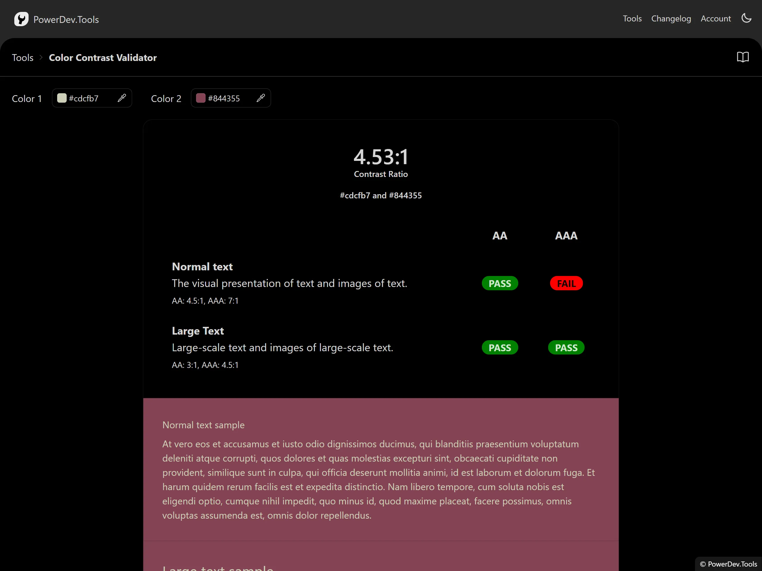
Check the WCAG contrast ratio to another color, from 1 (same color) to 21 (contrast b/w white and black).
Contrast ratio is a measure of the difference in brightness between two colors. It is used to ensure visual elements have enough contrast to be seen by those with visual impairments.
Select two colors to get the contrast ratio, and see how the colors play with each other on the provided example.
Level AAA requires a contrast ratio of at least 7:1 for normal text and 4.5:1 for large text.
Level AA requires a contrast ratio of at least 4.5:1 for normal text and 3:1 for large text.